Contest Details
|
Band
|
QSOs
|
Ctys
|
Zones
|
Callsign Used: | K3PP | |
|
160m
|
27
|
17
|
10
|
Operator(s): | K3PP | |
|
80m
|
136
|
60
|
13
|
Operator Category: | Single-Op Assisted | |
|
40m
|
179
|
81
|
24
|
Band: | All | |
|
20m
|
503
|
131
|
34
|
Power: | High | |
|
15m
|
563
|
128
|
31
|
Mode: | SSB | |
|
10m
|
87
|
22
|
9
|
Logging Software: | N1MM Logger v9.10.2 | |
|
ALL
|
1495
|
439
|
121
|
Club: | Frankford Radio Club |
| Claimed Score: | 2,357,040 | |
| Published Score: | 2,284,240 | 3.2% UBN Reduction (that's very good, by the way!) |
| Number 6 SOA in the United States!! My sixth Top Ten finish!! SO1R!! | ||
| Final results published in the August 2010 issue of CQ Magazine: | ||
|
Place
|
Call | Score | QSOs | Zones |
Countries
|
| 1 | W3UA/1 | 3,666,817 | 2,557 | 112 |
427
|
| 2 | K3WW | 3,503,694 | 2,218 | 124 |
462
|
| 3 | N4LA | 3,272,337 | 1,956 | 132 |
475
|
| 4 | AA3B | 2,741,760 | 1,837 | 108 |
436
|
| 5 | N3RS | 2,535,702 | 1,698 | 116 |
435
|
| 6 | K3PP | 2,284,240 | 1,484 | 121 |
439
|
| 7 | K2PLF/3 | 2,105,675 | 1,614 | 108 |
367
|
| 8 | N2MM | 2,089,542 | 1,546 | 116 |
418
|
| 9 | W1GD/2 | 1,975,815 | 1,346 | 112 |
417
|
| 10 | K0KX | 1,861,068 | 1,363 | 121 |
385
|
| Antennas: | |
|
160m
|
Inv-L with top at 60 ft. and base at 8 ft. with two elevated radials |
|
80m
|
Half-wave sloper from 60 ft to 10 ft sloping toward Europe |
|
40m
|
Dipole at 40 ft. |
|
20m
|
4 element Force-12 EF-420 monobander at 68 ft. |
|
15m
|
4 element Force-12 EF-415 monobander at 76 ft. |
|
10m
|
4 element Force-12 EF-410 monobander at 84 ft. |
Soapbox Comments:
My Acom 2000A amplifier died 30 minutes prior to kickoff! I had to do surgery to fix the HEATER VOLTAGE TOO LOW error. It was a smoked filament supply connector. The early Acoms are apparently notorious for this. What lousy timing, though! It delayed my contest start by 90 minutes!S
All in all, I'm pleased. I was pretty distracted at times with other things going on, but the station played well. I had trouble getting a decent long-term run going, but I usually smashed pileups with ease.
I was hoping for another Top Ten, after doubts from seeing a few of the other scores, I managed to eke out #6! What a thrill!! The return of 15m was so refreshing! Keep those spots coming, El Sol!
Top Stations:
In all, I worked 969 unique stations. Many thanks to every one of them! A few stand out as those I worked on five or six bands. They are:
| Call | 160m | 80m | 40m | 20m | 15m | 10m | |
| 4U1UN | ● | ● | ● | ● | ● | ● | 5 Six Banders |
| 8P5A | ● | ● | ● | ● | ● | ● | |
| PJ2T | ● | ● | ● | ● | ● | ● | |
| VP5T | ● | ● | ● | ● | ● | ● | |
| AA4V/VP9 | ● | ● | ● | ● | ● | ● | |
| CN2R | ● | ● | ● | ● | ● | 10 Five Banders | |
| HC8A | ● | ● | ● | ● | ● | ||
| KP2M | ● | ● | ● | ● | ● | ||
| OK5W | ● | ● | ● | ● | ● | ||
| ZY7C | ● | ● | ● | ● | ● | ||
| PZ5M | ● | ● | ● | ● | ● | ||
| VE7SZ | ● | ● | ● | ● | ● | ||
| VP2MDG | ● | ● | ● | ● | ● | ||
| VP5DX | ● | ● | ● | ● | ● | ||
| W3TB/VP9 | ● | ● | ● | ● | ● |
K3 Performance Plot:
The chart below is my Performance Plot for the contest. I developed this plot in Microsoft Excel several years as a graphical aid in analyzing contest performances.
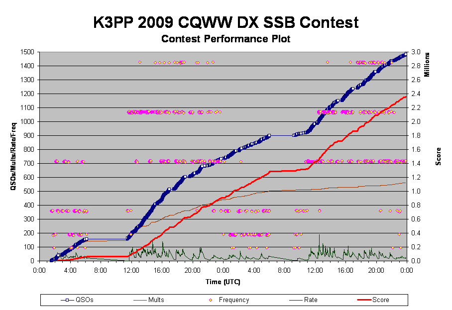
Here is what the Performance Plot shows:
- The thick red line is the score
- The dark blue line with the boxes shows the QSOs. Note how at high rates, the boxes squeeze together to form a solid thick blue line. The appearance of white in the boxes means my rate was not great/ I don't like white space on this line!
- The rate itself is plotted by the dark green line. The peaks in the rate naturally correlate with a steeper slope in the QSO line and the score grows faster, of course. High rate is a beautiful thing!
- The purple line shows the multipliers. Note that my score grew rapidly near the ned of the contest. My rate was not great during this period, but I was catching lots of new multipliers that contributed to this surge.
- The final data shown is the frequency, indicated by the pink and yellow bubbles. Here again, you can see an interesting visual effect of running stations at a high rate. The frequency bounces around during Search & Pounce mode, but a run sits on the same frequency for longer periods. A run can be seen as a straight horizontal "smear" of the bubbles. If the rate is good, you should see no yellow.
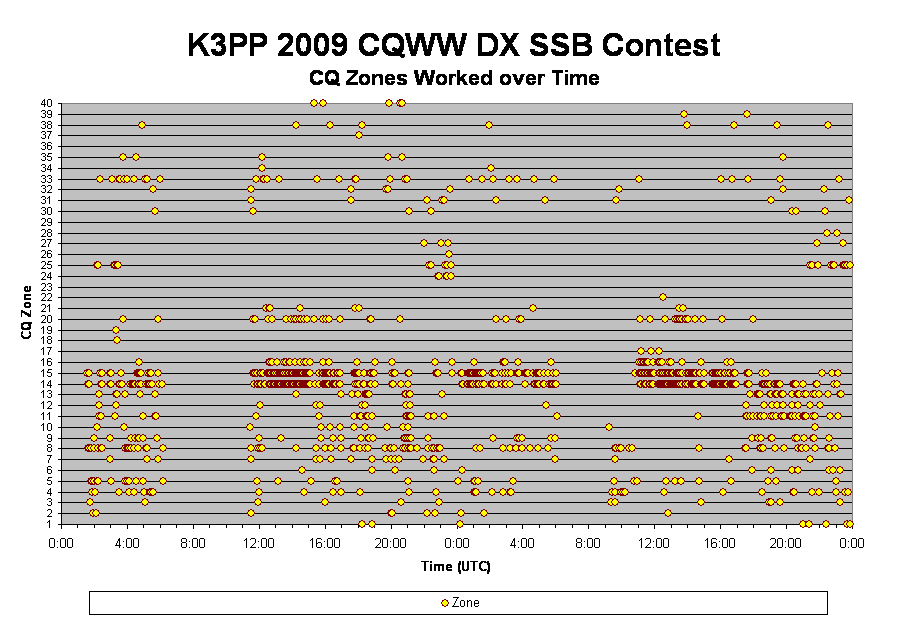
Rate Graphs:
The graph below shows my hourly rates broken down by band. The yellow bars indicate 20m, so you can easily see how 20m dominated this contest.
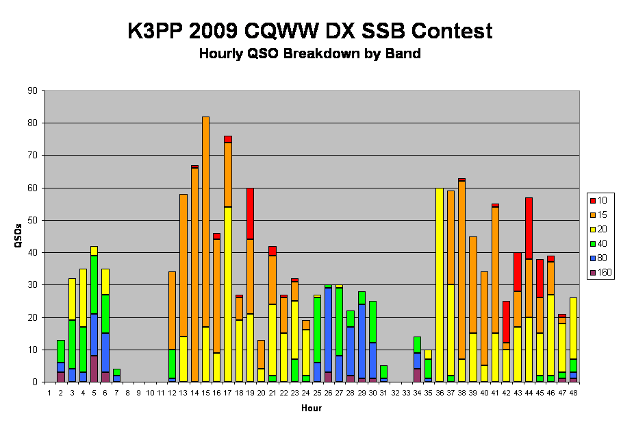
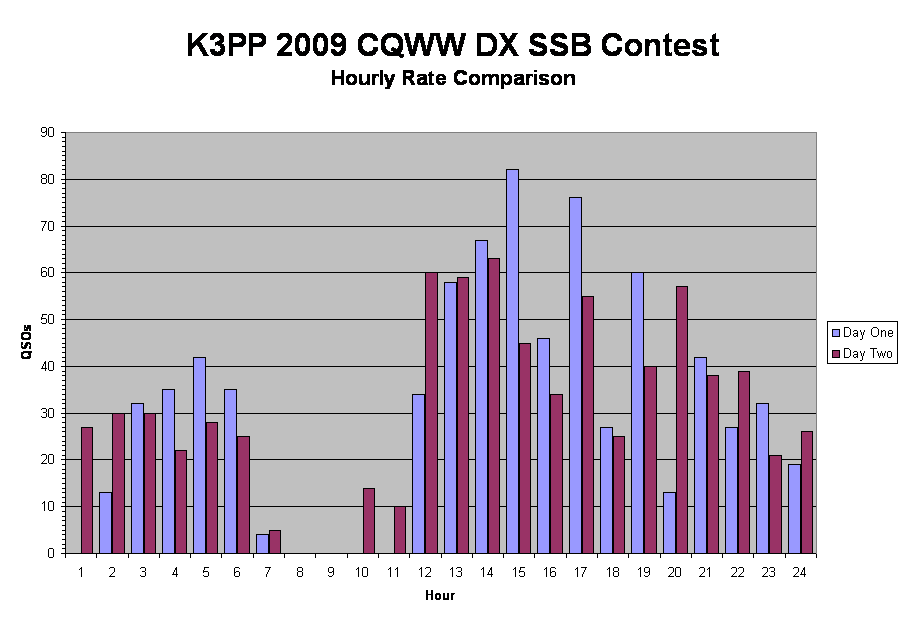
This graph shows the rates again, but this time overlaid to show the differences between day one and day two:
Top QSO Sources:
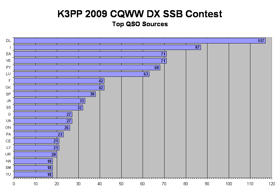
I can always count on the Germans, Italians, and Spaniards to give me a bunch of QSOs! Danke! Grazie! Gracias!
I surprised myself by the huge showing of Canadians. I know I log a lot of my friends up north, but the sheer number was unexpected! Thank you! Merci!
If there is any activity at all on 10m, it's always the Latin Americans who give us those QSOs! As usual, Brazil and Angentina were a cornucopia of action on the higher bands! Obrigado! Gracias!
The 21 countries in the chart below accounted for 883 of my QSOs! That's 59% of the total! Thank you to everyone!