Contest Details
|
Band
|
QSOs
|
Zones
|
Countries
|
Callsign Used: | K3PP | |
|
160m
|
20
|
9
|
15
|
Operator(s): | K3PP | |
|
80m
|
66
|
14
|
52
|
Operator Category: | Single-Op Assisted | |
|
40m
|
130
|
26
|
83
|
Band: | All | |
|
20m
|
628
|
40
|
135
|
Power: | High | |
|
15m
|
521
|
37
|
127
|
Mode: | SSB | |
|
10m
|
437
|
35
|
141
|
Club: | Frankford Radio Club | |
|
ALL
|
1802
|
161
|
553
|
3,653,538
|
points | Claimed Score |
|
1777
|
160
|
546
|
3,443,162
|
points | Final Published Score | |
| Antennas: | |
|
160m
|
Inv-V at 60 feet |
|
80m
|
Dipole @ 50 feet Force 12 EV-180 BV vertical with 4 raised radials at 10 feet |
|
40m
|
Dipole at 40 ft Ground mounted vertical (thanks K3CT!) |
|
20m
|
4 element Force-12 EF-420 monobander at 68 ft. |
|
15m
|
4 element Force-12 EF-415 monobander at 76 ft. |
|
10m
|
4 element Force-12 EF-410 monobander at 84 ft. |
Soapbox Comments:
This contest was my first full-blown Single-Op contest effort with High Power. What a rush it is to hold a run frequency for a long time and to blast through the pileups with relative ease! I came close to putting in the full 48 hours. Now I wish I'd done the WHOLE 48 hours, instead of taking the short nap each night! That, and a better showing on 10m, would likely have put me into the Top Ten US SOA. My Icom exciter has this terrible spike problem that caused all sorts of havoc on 10m. I've since found a way to better control the spikes, but that's another story for another forum!
The final scores were published in the September issue of CQ. After all the UBNs, I came in #15 SOA in the US. I'm definitely shooting for a Top Ten spot in 2000!
Thanks to everyone for the QSOs!
K3 Performance Plot:
The chart below is my Performance Plot for the contest. I developed this plot in Microsoft Excel several years as a graphical aid in analyzing contest performances.
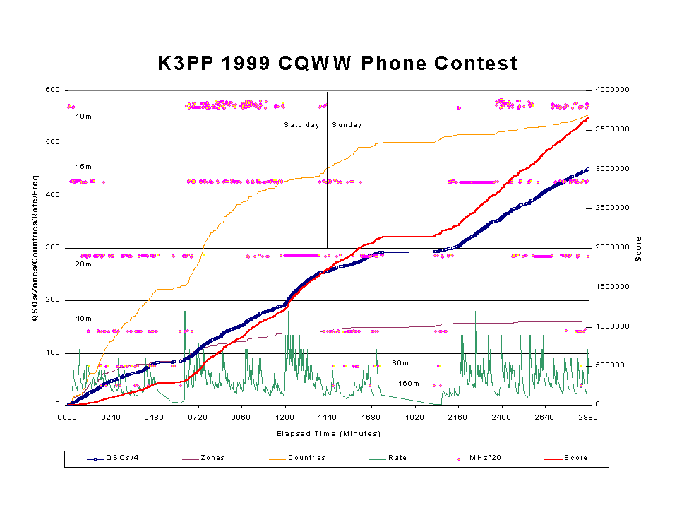
Here is what the Performance Plot shows:
- The thick red line is the score
- The dark blue line with the boxes shows the QSOs. Note how at high rates, the boxes squeeze together to form a solid thick blue line. The appearance of white in the boxes means my rate was not great. I don't like white space on this line!
- The rate itself is plotted by the dark green line. The peaks in the rate naturally correlate with a steeper slope in the QSO line and the score grows faster, of course. High rate is a beautiful thing!
- The purple and orange lines shows the multipliers (purple = zones, orange = countries).
- The final data shown is the frequency, indicated by the pink and yellow bubbles. Here again, you can see an interesting visual effect of running stations at a high rate. The frequency bounces around during Search & Pounce mode, but a run sits on the same frequency for longer periods. A run can be seen as a straight horizontal "smear" of the bubbles. If the rate is good, you should see no yellow.
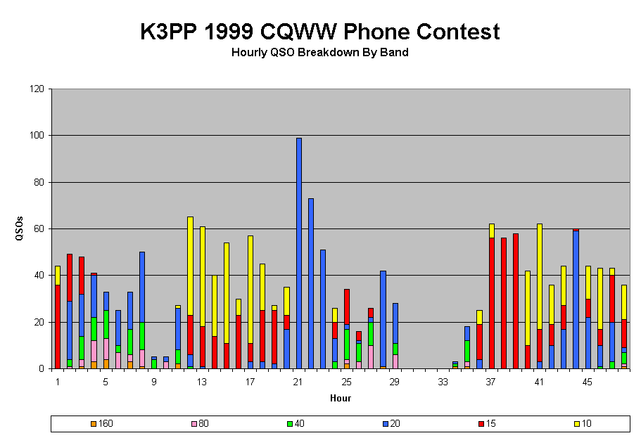
Rate Graphs:
The graph below shows my hourly rates broken down by band. You can clearly see the effect of my 20m run at the end of the first day.